
Adding text to your designs can get a bit boring- especially when you find yourself just adding plain colored text each time. But why not try to jazz up your text a little bit? One great, easy way you can do this involves adding a gradient fill to your text.
There are plenty of methods you can use to do this, but we’re going to go through the easiest and quickest one. All you need to do is double-click on the text layer to bring up the Layer Styles Window then, within this window, add a Gradient Overlay.
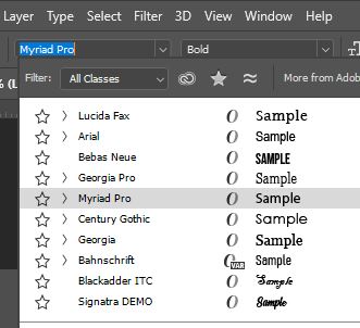
Before we begin, if you would like to find a new font to apply this effect to, then feel free to check out our tutorial on how to identify and find matches for a font in Photoshop!
Table of Contents
1: Use the Type Tool to create your Text
Once you have opened the image that you’d like to add the text to by going to File > Open or after you’ve created a new empty document via the File > New menu, you can go ahead and activate the Type Tool.
This tool can be chosen by clicking on the ‘T’ icon found in the toolbar down the left side of the screen. Alternatively, you can activate it by hitting the T button on your keyboard.

With the tool selected, let’s create a new text layer. To do this, simply click anywhere on the canvas (ideally in the position where you would like to add the text).

You will see that a cursor appears on the canvas and a new layer with a ‘T’ icon appears in the Layers Window, indicating that a new text layer has been created ready for you to type on.
Now that you have made a new text layer, you’re ready to add your piece of text! All you need to do is start typing as normal to spell out whatever text you’d like.

Don’t worry about how it looks at the moment: you can change the appearance of the text later on.
2: Edit the Properties of the Text
With the words now typed out, let’s change the settings of the body of text to customise how it looks.
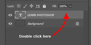
To make sure that Photoshop knows which text to edit, highlight the text you just added by double clicking on the ‘T’ thumbnail for the layer in the Layers Window.

When the Type Tool is active, a tool settings bar is present near the top of the screen. Here, you can set the properties of your highlighted text.

Choose any font that suits the purpose of your design. For this tutorial, we would recommend sticking to fonts with thicker strokes, as these tend to work best at letting the gradient show up enough.
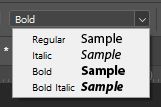
Alongside choosing a font, you can set the style of your text by making it bold or italic, for example.
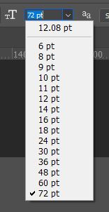
You can also pick a size for your text using the dropdown menu shown in the image below or by typing a value of your choice into the box.
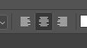
For bodies of text that take up multiple lines, choose an alignment style. This will determine where each new line of text sits in relation to the other lines: if you align them centrally then each line will be centred around the middle of the textbox, whereas if you align the text to one side, each new line will either start at the left of the textbox or end at the right, depending on which option you choose.
The color of the text doesn’t matter when we’re creating this effect, since the text will be filled with a gradient that will cover up the color anyway.
3: Use Layer Styles to create a Gradient
Now that you have created and edited the text, it’s time to add the gradient fill to it! To do so, we’re going to be working in the Layer Styles Window.
This can be opened by double clicking on the text layer in the Layers Window.
After doing this, you should notice that a new window appears, as shown below. This is where we will add the gradient overlay.

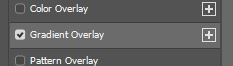
Within the Layer Styles Window, draw your attention towards the list down the left side of the box. From here, click on the heading ‘Gradient Overlay’.
This will apply a gradient overlay to the text and bring up a new section in the right side of the window where you can edit the appearance of the gradient.
4: Apply these settings to create a Gradient on your Text
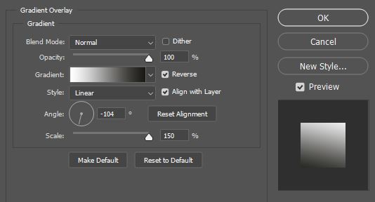
In the section of settings that has appeared, we’re now going to edit the gradient’s properties. Below is a diagram showing the functions of each of the options in the menu.

For this effect, an Opacity of 100% tends to work best, as this will ensure that the gradient is fully visible and the color of the text beneath it doesn’t show through. Similarly, we would recommend keeping the Blend Mode as Normal, as this will also preserve the intended appearance of the gradient (unless you want to experiment with creating alternative effects, in which case changing the blend mode might produce interesting outcomes).
Next, let’s set up the most important aspect of the gradient: the colors involved. To edit the colors of the gradient, start by clicking on the colored box, as indicated below.
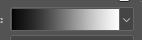
You should notice that a new dialog box opens up. At the top of this is a vast selection of pre-set gradients to choose from.
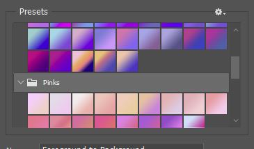
You can scroll through all these until you find one that you like, then select your favourite by clicking on it. Alternatively, if none of the presets suit your needs, you can create a gradient of your own.
The section to work in when creating a custom gradient is at the bottom of this dialog box, beneath the area containing the presets.
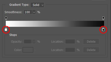
Along the colored line, you will notice various small boxes, as circled in the image above. Double-click on these to open a color palette where you can change the color at that point of the gradient. You can also click anywhere along the line to add a new color.

To edit the gradient further, you can click and drag the small colored boxes to move them along the line, changing the position at which they appear in the gradient.

Once you are happy with the colors in your gradient, you can go ahead and change the last few properties of the overlay, if you would like to edit it further.
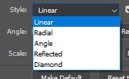
The Style option lets you choose the shape that the gradient follows. Linear is the most common type, but you can also choose other styles such as Radial which causes the gradient to follow a circular path.
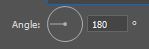
Changing the Angle lets you set the direction that the gradient will follow. An angle of 90 or 270 degrees will yield a vertical gradient, whereas an angle of 180 degrees produces a horizontal gradient.
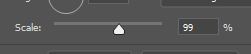
The final property that you might want to change is the Scale. A larger value here will allow for a smoother transition between the colors in your gradient.
When you are happy with all these settings, go ahead and click OK to confirm the changes. And when the window closes, you should see that you have now created an awesome gradient effect over your piece of text!

You may want to experiment with adding other effects on top of the gradient overlay. For instance, we tried adding a glow effect behind the text.

Or maybe you could add a bevel effect to the text to add more definition to the gradient. This can also be done in the Layer Styles Window.

VIDEO TUTORIAL
Want to discover more about how you can add a gradient effect to your text in Photoshop? Have a look at this video by VerticDesigns which provides a helpful visual walkthrough of the process!
![Photoshop: Gradient Text Effect [8]](https://www.learn-photoshop.club/wp-content/plugins/wp-youtube-lyte/lyteCache.php?origThumbUrl=https%3A%2F%2Fi.ytimg.com%2Fvi%2FUsc42WPXfRI%2F0.jpg)
Hey, I'm a Professional Retoucher making $10k a month thanks to Photoshop.Register to my newsletter to get freelancing tips and a FREE Brush Pack in Bonus! My Newsletter