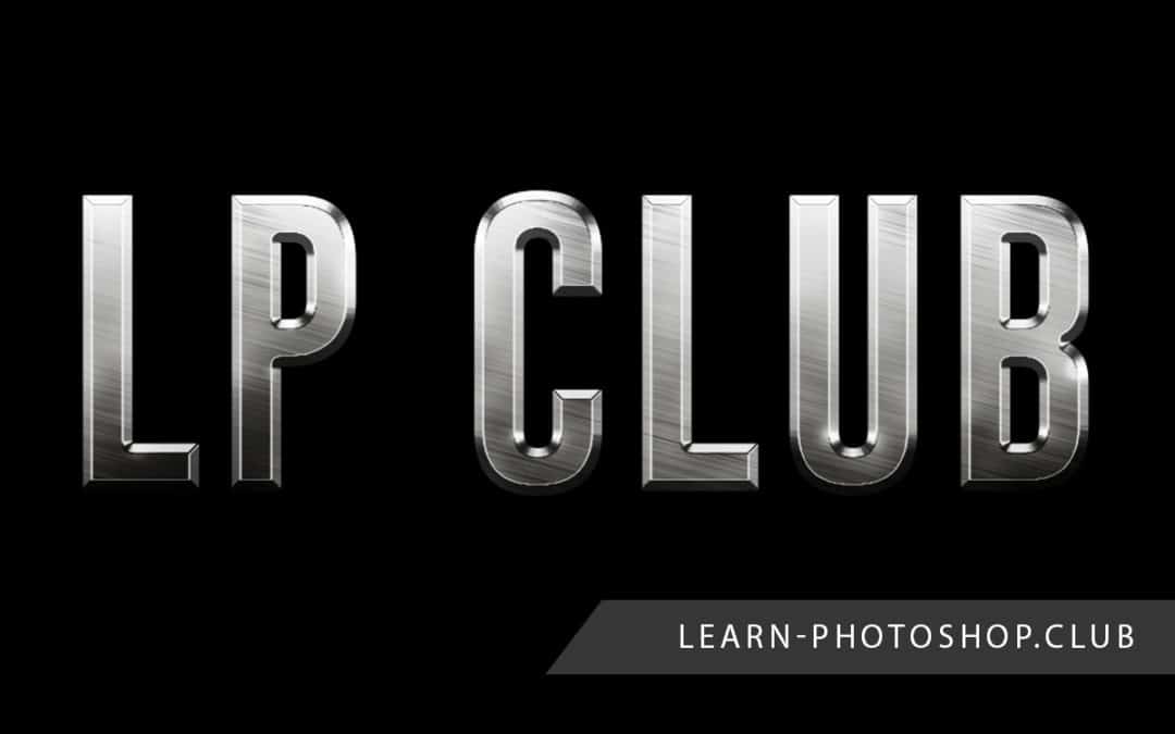
Typography is a central aspect of the design of movie posters, book covers, video games, advertisements and more. The effectiveness of a piece of text is intensified when it fits with the theme of the work. So, knowing how to create a metallic text effect can be really handy, as the effect can complement a whole range of themes- from historical pieces to comic books.
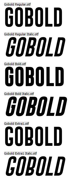
Before we begin, note that this process tends to work best with bolder, thicker texts, such as the one we used, shown below, from Dafont. If you want to download the same font as us (which can be found here) or any other font from the internet, then refer to our article on how to add fonts to Photoshop.
1: Go to File > New to Create a New Document with Dimensions Slightly Larger Than the Ones You Need
As always, we’ll begin by choosing File > New to create a new document.

Upon selecting this, a window should open in which you can set the properties of the document. We can pretty much keep everything as default, but we’ll probably want to change the dimensions.
In this case, you’ll actually have to make the dimensions slightly bigger than what you have in mind, for reasons that will be made clearer later on. For instance, I want my file to be around 1200 x 800, but I’ll set it to be 1250 x 850 for now.

When you’re happy, click OK.
2: Use the Paint Bucket Tool to Fill the Document with Black
Now that we have a new document open, we’re going to fill the background with black. Go ahead and press D on your keyboard to set the foreground and background colors to default, if they’re not already so. The foreground color should be black.

Then just hit Alt + Backspace [Win] / Option + Delete [Mac] on your keyboard to fill the layer with black. If you’d prefer not to use shortcuts, then you can select the Paint Bucket Tool from the toolbar down the left side of your screen, represented by the icon shown below, then click anywhere within the canvas to fill it.

Your document should now be filled with black.

3: Create a New Empty Layer by Clicking on the New Layer Icon at the Bottom of the Layers Window
The next thing to do is to create a new layer. This can be done really quickly by selecting the ‘New Layer’ icon, second to the right at the bottom of the Layers Window.

You should now have two layers: one that’s solid black, and one that’s empty, like below.

4: Head to Edit > Fill and Fill the New Layer with a Custom Light Gray
Making sure that the new layer is active by clicking on it in the Layers Window, let’s head to Edit > Fill to fill the layer with a light gray color.

In the Fill Dialog Box that opens, click on the dropdown menu entitled ‘Contents’, and select ‘Color’ from the list that appears.

Clicking this will automatically open a color picker, from which you can select the fill color. Go ahead and choose a light gray from the color palette. You can use the same one as we did (R = 159, G = 158, B = 158), but any similar color should be fine, it doesn’t have to be too precise at all.

Once you’re done, click OK to apply the fill.
5: Select Filter > Noise > Add Noise and Set the Amount to Around 165%
With a plain gray layer set up, we can now add noise to start creating the metallic effect! Head to the menu along the top of the screen and select Filter > Noise > Add Noise.

In the dialog box that opens, as a result, set the Amount to Around 150%. You can play around with this, since the most suitable value may vary depending on the properties of your file. On top of this, ensure that the Gaussian and Monochromatic options are ticked.

Click OK when you’re ready.
6: Choose Filter > Blur > Motion Blur and Add a Blur of an Angle of -15 Degrees and a Distance of 280 Pixels
Now at this point, the effect isn’t looking very metal-like. So, to create a brushed metal effect, let’s add a Motion Blur to our noise layer.
From the top of the screen, choose Filter > Blur > Motion Blur.

In the options window that comes up set the Angle to -15 degrees and the Distance to Around 280 pixels. Again, the best value will depend on the size of your file, so feel free to experiment with it.

When you’re done, click OK to apply the blur.
7: Use the Crop Tool to Eliminate the Edges Where the Pixels Haven’t Been Blurred as Effectively
As you can see, Photoshop has trouble blurring the pixels at the edges of documents, hence the visible change in a pattern around the perimeter of the canvas. Luckily, since we made the document bigger at the start, this won’t be a problem for us, as we can simply crop out the edges.
Select the Crop Tool from the toolbar down the left side of the screen, shown by the icon in the image below. Alternatively, you can press the C key on your keyboard.

With the tool selected, click on the top left corner of the good section (the area that we want to keep) and drag the mouse whilst holding it down to the bottom right corner of the well-blurred area.

Release the mouse once you’re happy with the selected area and hit the enter key on your keyboard to crop the document.

8: Use the Type Tool to Type in Your Desired Text
At this point, we can add the text! As we said at the start, it’s best to use a bolder font in this case, such as Arial Bold, rather than one built from thin strokes. If you want to use the same font as us or download your own, then head to the top of the article to read the instructions.
So, begin by selecting the Type Tool from the toolbar down the left of the screen.

Clicking on the icon should open an options bar along the top of the screen, where you have options to choose the font, color, size, and style of the text. Make the size pretty big- at this point, it doesn’t really matter as we can resize it with the Free Transform Tool later on, but it’s best to make it as close to the size you ultimately want as possible.

Set the color to be black and choose whichever font you want. Then just click anywhere to start typing!

9: Go to Edit > Free Transform and Resize the Text by Dragging the Corners Whilst Holding Shift to Preserve the Original Proportions
If you couldn’t get the text to be the right size, then you can resize it at this point using the Free Transform Tool. You can bring it up easily by hitting Ctrl + T [Win] / Cmd + T [Mac], or by going along the top of the screen to Edit > Free Transform.

You should see that a box with cursor points appears around the object. To resize the object, we’re going to use only the corner ones.

So, whilst holding down the Shift key to maintain the original proportions and avoid stretching the text, go ahead and drag any of the four corners outwards or towards the center to increase or decrease the size of the text, respectively.

You can also move the text around the document by simply clicking on it and dragging it.

Hit Enter when you’re done to apply the transformation.
10: Head to the Layers Window and Move the Text Layer Below the Texture Layer
Because we want to clip the texture layer to the text layer, the text layer will need to be beneath it. We can quickly change the layer order in Photoshop within the Layers Window, which should be located at the bottom right of your screen.

Head here, and click and drag the text layer, which will probably be at the top, to the gap between the background layer and the texture layer. Hover it over here until a blue bar appears, then drop it.

You should now see that the layer order has been changed, and in the document window, the text will be temporarily hidden by the texture layer above it.

11: Select the Texture Layer (Layer 1) and Go to Layer > Create Clipping Mask
Now that the layers are in the right order, we can clip the texture layer to the text layer so that it only appears on the text and not the background. To do this, we can use a Clipping Mask.
Click on the texture layer in the Layers Window to make it active and go to Layer > Create Clipping Mask along the top of the screen.

Alternatively, you can right click on the layer and choose Create Clipping Mask from the list that comes up as a result.

And suddenly you’ll see that the texture just appears on the text and not the background! We’ve now got the basis of the metallic text effect formed.

12: Double Click on the Text Layer to Open the Layer Effects Panel and Add a ‘Bevel and Emboss’, Inputting the Following Settings
We’ll now focus on adding more depth to the design. Double click on the text layer in the Layers Window to open the Layer Style Window.

In the window that opens, choose Bevel and Emboss from the list down the left.

Now, under the heading ‘Structure’, just input the values given below as the settings, or alter them to fit your preferences.
- Technique: Chisel Hard
- Size: 6px
- Depth: 584%

Under the heading ‘Shading’, click on the gloss contour thumbnail, as shown below.

Doing so opens the Contour Editor. Click the Preset dropdown box at the top and choose Ring from the list that comes up. Then click OK to exit.

Now we’re back into the Layer Styles Window, we’ll also take some time to play around with the opacity of the highlights and shadows. Alter the values with the sliders until you’re happy with the effect. Also, make sure that the checkbox entitled ‘Anti-Aliased’ is ticked.

13: Stay in the Layer Styles Window and Add a Black and White Gradient Overlay of 70% Opacity
We won’t exit the Layer Styles Window just yet, as the next thing we want to add is a gradient overlay, which can be done in the same panel.
Go ahead and choose Gradient Overlay from the left column in the Layers Window.

By default, you should see that the gradient is set to black and transparent, like the one shown below. If it’s not, for any reason, then simply click on the gradient preview bar and select the top left icon from the options that appear.
Then, just set the Blend Mode to Overlay and the Opacity to around 90% and click OK to exit when you’re done.

14: Add a New Layer Clipped to the Text and Go to Filter > Render > Clouds to Add Random Highlights and Shadows
Although the gradient overlay has made the lighting more interesting, and the text is now looking less flat, there are a few final touches we can add just to make the effect more convincing.
One way in which we can do this is to add clouds- an automated Photoshop effect- to mimic random highlights and shadows and add texture to the piece.
Let’s click on the top layer, then make a new layer by clicking on the New Layer Icon at the bottom of the Layers Window.

Then right-click on the new layer and choose Create Clipping Mask from the list that comes up as a result. The layer will now be clipped to the text as well.

Head to Filter > Render > Clouds. Doing so will create an automated effect that should look something like the example below.

15: Select Filter > Blur > Gaussian Blur to Add a Blur of Radius 10, to Make the Effect Look More Convincing and Less Cloud-Like
To finish off, we’ll tone down the clouds effect slightly by adding a Gaussian Blur to make them look more like highlights and shadows than like clouds. Let’s select Filter > Blur > Gaussian Blur from the top of the screen.

In the options window that opens, set the Radius to around 5 pixels (or experiment with the value until you find one that fits your preferences), and hit OK when you’re done.

Then, head back over to the Layers Window and change the Blend Mode of the clouds layer to Overlay by clicking on the dropdown menu at the top left of the window and choosing Overlay from the list that appears.

You can then decrease the opacity of the layer to fit your preferences at the top right of the window.

And once you’re happy, you should be finished!

BONUS
Want to find out more about how to create a metallic text effect in Photoshop? Then check out this video by EnvatoTuts+ that takes you through the process or this video by WolfE101 that demonstrates how to apply similar techniques to add the effect to a logo.
Hey, I'm a Professional Retoucher making $10k a month thanks to Photoshop.Register to my newsletter to get freelancing tips and a FREE Brush Pack in Bonus! My Newsletter